Saturday, February 18, 2017

FLOWERS: TAKE 20

Variety is the Spice of Life

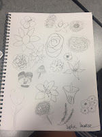
For this weeks assignment, we were told to draw either trees, birds, flowers, or houses. Once we had selected our choice we would have to sketch that item not once, not twice, but twenty times, each one being a different. I had chosen flowers so I had to draw twenty different flowers. My biggest struggle was finding different flowers that were noticeably different from each other but still being able to draw them. Once I had multiple flowers to draw, however, the process was quiet simple since all I had to do was sketch the flowers in an order that was appealing. To make the flowers different I found ones with different petal shapes and designs so that way you look at them and immediately tell they were different. At the beginning it was fun and easy because I had so many options but as time went one it started to become more difficult because I was running out of options. Overall, I think it made me a better graphic designer but it was still a little challenging.

Finally Being Able to Bloom

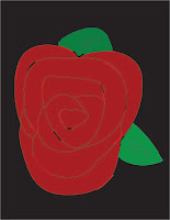
Once I had all twenty flowers drawn I had to choose one to make in Illustrator. I decided to make the drew in Illustrator. Choosing my flower difficult because I wanted a simple yet challenging flower so that way I knew I could do a good job but it wouldn't just be a bland flower. Originally I had chosen the flower in the top left hand corner but it wasn't turning out how I wanted so instead I made the rose. To start off making the rose I made the lines that would make up the petals in black.Then, once all the petals were drawn I filled them in with red. I also decided to add some shadows with black and highlights with a light red to the rose to add dimension  At this point I had decided I made the rose to big so I had to shrink it done in size a little. After I had made it a little smaller I had the leafs in a similar way I did the petals. Once the petals were done I had the rose a little smaller again. Then I made the background black so the red and green would pop more.

New Experiences 

Overall, I really liked this project because it was different and allowed for a little more creativity. This project was also difficult because of the number of flowers I had to draw and making the rose in Illustrator was difficult but enjoyable. I also really liked to project because instead of having a set picture or object we could create anything we wanted as long as it was a bird, tree, house, or flower. This project also allowed to see haw the tools we learned about in class are used to create actual designs. This is my favorite project we have done in graphic design so far.

Tuesday, February 14, 2017

DIVING DEEP INTO MY PSYCHE

The Type Of Person I Am

This week in graphic design we took a test that would tell us our personality based on the Myers-Briggs personality test. After taking the test I learned that my personality was an ENFJ. ENFJ stands for Extravert Intuitive Feeling and Judging. Having characteristics means that I am out going, love to be around people, I take part in a situation or action before I stop to think about what I'm doing, I am thoughtful toward other peoples feelings and what they think. I also see potential and promise in everyone and can be the most responsible in a group of people. I am not the only one with this personality type however, some people are ENFJ personalities as well. Some of these celebrities include Dr. Marin Luther King Jr., Nelson Mandela, Joe Biden, Oprah Winfrey, Bono, Jennifer Lawrence, Emma Stone, and many other people. It's kinda cool to think that I have the same personality of some of the most important, revolutionary people in history and also some of the most popular people in todays world.

How Well Does This Test Know Me

Most personality test don't do to well describing what kind of person you are, but this test is different.  After reading the description of an ENFJ I realized that is test described my personality almost to a T. The part of my personality it got right was that I am an extrovert, when making decisions I take other peoples feelings and thoughts into consideration, and sometimes I act before I think. The part that says I act before I think is both correct and incorrect. If I'm planning to go to the movies with friends then I while lots of thought and planning into it but if it's a spur of the moment thing thats when I act before I think. The most common situation where I act before I think is when I'm talking. Since I am an extrovert I talk a lot and I tend to talk really fast, so my brain doesn't have time to process everything that is coming out of my mouth. Reading my personality description helped me understand why I do talk so much and like being around people. It also helped me learn why sometimes I put my own feelings aside when making plans and putting somebodies in front of mine. I also learned why I get so bored when I'm sitting at home doing nothing.


The Role I Was Meant To Play

When ever I find myself in a group for school whether that be for a project, a seating arrangement, or just my group of friends I find myself taking charge and quiet possible be the one most talkative. After taking this personality test I realized I take on these roles natural because I am an extroverted, intuitive person. I also take on the role as problem solver because I can see where both sides are coming from but can help resolve the problem by relating to their feelings and talking about them. If I am assigned a certain role that fits my personality type then I am able to perform at my best ability and can help my team/group by contributing my best work. If the job I am assigned does not fit my personality type, then I will simply try my hardest to succeed even if I might not good or well suited for that job. I have a very loud voice and sometimes I don't realize how loud I am until somebody tells me. Some people in the past might have thought of me being purposefully loud, talking frequently or just being very energetic annoying and on purpose when I don't realize it because thats my personality type. Another part of my personality type is that I'm feeling which means I think about others peoples feelings. People who I have problems with usually don't have this personality type because they'll say something mean that could hurt a persons feelings with out realizing it. I don't like these people because I see them as rude, ignorant, and mean. 

Lessons To Live By

After taking this personality test I learned that personalities are very complicated and have many different parts to them. There are so many different parts that make up a persons personality that I had never known about before. I also learned that there are so many different types that several people have. All these different types are very important in groups and projects because everybody has a different way of doing things. Even though all of our personalities are different and unique thats what makes us valuable and needed. 

Personality Test Take Two

After we had finished learning about the Myers-Briggs personality test we took, we then took a LOBGR test. The LOBGR test tells you about your personality through animals. The test is made up of four columns that each have personality traits in them. To take the test you go across each row
putting the number 4 through 1, 4 being most like you and 1 being least like you, next to each personality trait. At the end you add the numbers in each column up. The column with the highest total is what animal you are. My highest total was in the first column which corresponded with a lion. Lions like to lead, are very goal-oriented, like challenges and assignments, are very aggressive, and in some situations tend to be a tad bit bossy. Me being a lion makes sense because I can identify with these traits of a lion.


Monday, February 6, 2017

COLORS!!!!!!!!

My Favorite Color To Look At

Most people in the human race have a favorite color, whether thats red, blue, green, yellow, or chartreuse. My favorite color just happens to be mint green.Mint green is my favorite color because it can either be bright and soft, can be used in clothing, foods, accessories, etc. and still look appealing. I also like how unique it is since its a tint, when you add white to color, and no not one of the primary or secondary colors in the color wheel. Whenever I wear something that is mint green, I always feel good and unique because nobody else is wearing it, I also look really good in mint green. The emotion si feel when I look at mint green are happy, calm, and peaceful. I like feelings these emotions because as life becomes more complicated and hacked they don't come naturally as much as they used to. Seeing the color also makes me remember  when I would go shopping with my friends or dad because if something was mint green it would stand out and I would remember it. Mint green is my favorite color because it makes me feel good, is pleasing to look at, and makes me think of pleasant memories. 


My Least Favorite Color To Look At

Just like favorite colors, most people have a least favorite color. My least favorite color is orange. I do not like orange because it is to bright and when ever its dimmed down it looks bad and unappealing. Orange clothing isn't the most appealing either and can look really obnoxious and gives me a headache. When I look at the color orange I get anxious sometimes because its mostly used for cation signs and,once again, because its so bright and loud. Unlike with mint green, I don't have any memories with orange so I can't associated with any good events in my life. Another reason why I don't like orange is because it was my grandfathers favorite color but he passed before I got to know him. Due to these events when ever I see orange it reminds of my grandfather I will never get to talk to, all I can do is hear stories about him. Since I don't have expositive feelings or memories with orange, it is my least favorite color. 


The Effects Of Color

Color is not just color. Color is emotions, feelings, moments, memories, designs, and so much more. When you look at a certain color you feel or think about an emotion, for example when you see red you think or anger. We also associate certain moments and memories with colors on occasion. When we hear wedding we think of white, when we think of pay day we think of green, etc. Companies use this advertisements so you feel a certain way when you see their logos and products. Technology company logos are blue so you feel calm while using it, food companies are red so they get your attention, and more. Color combination is also important. The combination of colors needs to look appealing to eye so that people like to look at it. Color combination is used most in graphic design because we want the design to look nice and appealing to the eye and a main part of how we achieve this is combining colors that look well together. If we did not do this then our designs would look sloppy and nobody would want to look at the design. We learned about how to see if colors complement each other by looking at a color wheel, like the one above, and looking in certain places according to the color I want to match.


Thursday, February 2, 2017

ADDING TO MY TOOL BOX

In The Beginning 

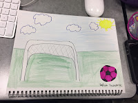
To start off my new project in graphic design I first sketched what I wanted to design. The assignment was to make something using the shape tool we learned earlier, so I thought I would create a soccer goal and soccer ball in an outside setting. Within my sketch I used the key elements in several
different ways. I used lines to show the separation between sky and grass, and to also so the rigidness in the goal but then used curved lines in the clouds to show how soft and gentle they are. In this sketch I basically used lines to show the difference between the rigidness in certain objects but then contrasting it with softer lines. The use of color was to show what things were naturally darker and lighter while also using darker colors in front and lighter in back to bring more of a focus towards the front. The use of value also plays into this concept by using light colors in certain places but then going into darker colors as you moved toward the front as kind of a transition. The size of the objects within my sketch also help bring more attention to the front and show perception and depth. I was able to achieve this by making the goal and soccer ball bigger than the sun and the clouds. With in this sketch I did not use any textures because I wanted to the design simple and smooth. However I did use space to show the dimensions of the drawing and the difference between the grass and the sky. I used all of these elements to sketch my new design and make it visually appealing.

Using My Training 

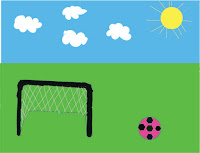
To be able to create my design in Adobe Illustrator I had to use the pencil and shape tool that I had recently learned how to use. I first use the pencil tool to make the shape of the goal since I wasn't able to get the shape I wanted with the shape tool. Then I used to shape tool to create the lines for the goal net. After I finished the goal I moved to the soccer ball, which was quiet easy to make. To make the
ball I simply created a circle using the shape tool and then created some hexagons within the circle using the shape tool after switching the shape it would create. I then created lines connecting the hexagons together. After the soccer ball was done I selected each hexagon and colored them black then I selected the circle that made up the ball and colored it in pink. I then colored the goal in black using the paint brush tool. Once the goal and ball were colored I created a green square for the grass, after it was in place I move it the back of the page so that way the goal and ball would be on it. Then I moved onto the sky, I used the same technique I used for the grass for the sky, I just cooled the rectangle blue. After that I thought it would be cool if I added some clouds so I went to the pencil tool and drew some squiggly lines that looked like clouds. Then I selected each one a filled them in white. Once the clouds were done I moved on to the sun which just consist of a yellow circle and lines made using the shape tool. This project was really fun and I enjoyed it since I could make several different shapes.

Using My Training (pt.2)

After I learned about the pencil and shape tool, I learned how to use the shaper tool. The shaper tool
is different from the shape tool because it allows you to manipulate the shapes more and makes shapes from seemingly random lines. The project that we had to do using the shaper tool was to make a kind of eyeball like shape that is red and then a rectangle that is blue behind it. Building the eyeball shape was easy but when it came to pulling the rectangle behind the eye I ran into some difficulties. This part was hard for me because when ever I would drag the rectangle into place the eyeball would turn blue and when I would move the rectangle to the back part of the eye would be blue and the other part would be red. After several attempts I successfully put the rectangle in place without messing up the eyeball.

My Thoughts

After working with Adobe Illustrator for two weeks I have a pretty good idea on how it works. Most of the tools are pretty easy to use and understand and the ones that aren't get easier as I use them more often. Sometimes coloring lines and shapes can be difficult but the more I use the program the easier it is to use the colors and understand what I have to get what I want. Overall I'm liking the program more than I expected and I'm looking forward to learning more about as the quarter continues.