Tuesday, December 19, 2017

ANIME(TION)

This One Took Forever

This was my final 2D animation where I had to include everything I had learned so far this year. Throughout this project I learned that sometime simplicity is key. At the beginning I started off with a story that was to complicated and cut it back or else I wouldn't finish. The original one would have had to many elements that would have to be created and animated and I just didn't have time for it, so I took parts out. In the end I'm really proud of this project and want more people to see it since I put a lot of effort in it and looks half decent. One of my greatest strengths in this project was probably creating everything in Photoshop before actually animating it. I was pretty good with the pin point tool. One of my weaknesses, however, was the walk cycle. I was able to improve, although, by adding pin points in the knees but I still need a lot of practice and work on it. One aspect about this project I would change is the walk cycle and how my clouds look. I feel like I could've done the walk cycle more smooth but just didn't have time. I'm going to use what I learned from this project to better my future projects and know what I need to work on.


I'm Somewhat Proud Of This

By creating this project, I was able to learn how to do a walk cycle for a two legged creature. I learned this skill by paying attention in class as well trial and error. Additionally, I also learned how to scan something I drew on paper into the computer. I forgot how to do a portion of the scanning so I had to have help for a classmate. I picked this project because I had some struggles with it in the beginning and couldn't get my robot looking how I wanted, I couldn't figure out the walk cycle, etc., but through my trial and error  I was able to produce an animation that I think is decent and proud of. One of my greatest strengths for this project was creativity with making my character a robot and not a human, as well as making the head spin at the end. My greatest weakness was the walk cycle because I did it backwards so I have to make my robot walk backwards. I was to improve, however, by working and focusing on making my walk cycle the best it can be. If I could change anything, I would change how my robot looks because he looks really spotty and messy and I want him to look nicer. Overall, I will use what I learned in this project whenever I'm animating something that needs to walk or move in a similar way. 

This Doesn't Completely Look Bad

By doing this project I learned so much about the animating software, Maya, and several skills as well. I learned how to create dips/a bowl shape out of cylinders, how to combine shapes, add textures using pictures, and what tool to use to align shapes. I learned these things by having to create the towers for my castle, needing to add a stone texture to walls, and making sure everything was even and neat. I picked this project because I'm really proud of how it turned out especially since I was gone when the instructions were given. My greatest strength is probably the textures even though I had some getting them to show up my first time. Once I found out what I was doing, however, it was easy from then one. One the other hand, my greatest weakness was probably creating the towers and beveling. It took me forever to figure out how to get it to work, but eventually I got it down and was able to do it pretty easily since. I'm going to use what I learned when needing add textures an surface and when I'm creating a building. One thing I would change is the size of my towers, the look really big and I don't like them. Overall this project was really fun to make. 
My Favorite 3D Project

Animating this project let me learn how to create holes in a polygon. You did this by putting cylinders through it and then taking out the spaces where they touched, creating hole. I also learned how to light an object from doing a worksheet and watching a Youtube video. I picked this project because it turned out super good and I'm proud of how well I did on it. My greatest strength in this project was lighting the object. I was able to understand the lighting really easily and caught on to it pretty fast. My weakness, however, was getting the holes to appear properly. My first few tries resulted in all . my shapes disappearing but I was eventually able to make it work. I improved on this skill by figuring out what angle for clicking worked the best. I'm going to use what I learned to light the rest of my projects in a professional, appropriate manor. I wouldn't really change anything about this project except make the plane lighter, its to dark. Overall, I'm really proud of this project and think its's one of my best. 


PRO-CEDURE

Prepare To Learn Some Knowledge

In this blog post I will be teaching you to make a 3D sphere in the animation program called Maya. The person who would nee this tutorial is on that has never used Maya perform and needs to learn the basics, but this skill be used by anybody that has Maya on their computer.  This skill is important to learn so you are able to begin animating and creating projects. All the other polygons in Maya can be made in a similar fashion, so once you learn how to create a sphere you can create any other shape you want. 


1. The first step is open Maya to where it looks like this. 


2. Then we have to create a new project. Go to file and then click on Project Window.


3. Once you click on it, a window like the one below should appear. Click the "New" button in the top right hand corner. Name the file whatever you would like and then press "Accept to begin animating. 


4. Once the file is created, click on the tab named "Poly Modeling" so the banner looks like the below.


 5. Click on the orange sphere, which is the shape farthest to the left, in the banner to create on your plan.


6. Click on the plane and drag to make your sphere the desired size you would like it at.


7. Once you have created your sphere you press "Save" or "Save As" under File. You do not need to repeat step 2 and 3 when working on this project again, simply just reopen this file. 


Additional Resources

This tutorial will take you more in depth in the modeling process as well as teach you about texturing. I hope this will help you further your animations and help you in the future. 


Monday, December 18, 2017

MAN....I WISH I COULD DO THAT

Summery

The short filmed I watched was called "First Date Short Film" by First Date Team. This film was about two people who met for a first date and as the date goes on incidence happen that reveal who they really are. At first you thought the girl was going to be cooler than the guy because he a nerd. However, we find out that the girl altered her appearance with makeup and implants. Even though she wasn't completely honest the guy still likes her and, instead of leaving, takes off his wig to revel a bald head. At the end they both skip off and live happily ever after. I really enjoyed this film because it was light hearted and sweet.

I Become A Film Critic

The animation was really good. All the characters had their own distinct quirks that made them them and were really fun to watch. These quirks also fit with the overall cartoonish feel of the film. The man on the date had a very exaggerated walk, bringing his knees up higher than the normal person. On the other hand the waiter took little steps that made him appear as if he were simply bouncing up and down rather than walking. The movements of the characters were very smooth, even when they grabbed something, there was nothing off, no spaces that wouldn't naturally be there, and, while it was cartoonish, it still had an element of realism. One thing they could do to improve the film is add more texture, everything was really flat. Adding texture would make it more entertaining and add more dimension. Overall, the production of the film was very good and smooth.

I Can Kind Of Do That

Watching an animated short while taking animation is cool because I can look and see what skills I can apply to my projects and what ones I already know. One of the skills I can learn to apply to my work is making peoples mouths move to talk. I think that would be really interesting to learn how to do because then I could make my own short film. Even though I can learn a lot of skills used in this project,  I already know how to do some as well. One skill I already know how to use is the pin point tool/moving elbows and knees.


CGMeetUp. “CGI Animated Short Film "First Date Short Film" by First Date Team.” YouTube, YouTube, 18 Nov. 2017, www.youtube.com/watch?v=aGoFcDR7Ia8. 18 Dec. 2017

ANIMATION. A GLOBAL FRONTIER

China is know for producing most things we use here in the United States except cartoons. However the masterminds and animators apart of Up Studios in China are about to change that with their new cartoon. Trevor Lai, founder and leader of Up Studios, has been able to create a show called Super BOOMi that's the potential to go worldwide instead of just national in China.
https://www.awn.com/animationworld/trevor-lai-and-super-boomi-taking-china-storm

Sketching Out The Plans

Throughout the article, the author shows how many Chinese animations and characters don't make it out of China. He shows us how Super BOOMi  is different by how it focuses on universal themes and elements instead of having it focus specifically on Chinese culture and traditions like most animations  Super BOOMi is different from other shows and why this one is spreading and the others aren't. Overall, throughout the article the points are supported.
do. The author does a really good job by doing this with his own commentary but also getting direct information and quotes from the creator himself, Trevor Lai. He also brings in evidence outside if the animation and tv realm by showing the character of the showing being placed in hotels, spreading the popularity of the show further. One weakness, however, is that the author doesn't really elaborate how

Getting To The Point

The authors main conclusions for this article are that the show Super BOOMi will soon reach audiences outside of China. He also sees a very bright future for Up Studios with them producing another show based off the book called Tomo. This show will also deal with universal themes hence the prediction for global success. As a whole I thought that the article was very well put together and all points helped support the idea that Up Studios as a whole would soon have global animations with Super BOOMi being the first of those animations. All the evidence added to the argument and had a purpose.

Final Thoughts

This article taught me how to make products that appeal to a wider audience. I can use this skill in the future when I start working in a creative field to help know how to make the most money off of what I'm creating. In order to make something appeal to a global audience it had to deal with themes that everyone can understand and relate to, instead of ones that are specific to one culture or country. I was able to understand the article pretty well because it didn't have to much tricky vocabulary. Overall, I really enjoyed reading this article and might do it more.

Citation:   “Trevor Lai and 'Super BOOMi' Taking China by Storm.” Animation World Network, 12 Dec. 2017, www.awn.com/animationworld/trevor-lai-and-super-boomi-taking-china-storm. 18 Dec. 2017

Friday, December 15, 2017

ONW NOW ...... BUT BETTER

Becoming A News Reporter?

For our final project in convergence video we had to put on our own edition of ONW NOW. ONW NOW is a weekly news show that my school produces. For our project we had to create a show that was less than ten minutes long with an original intro, lower thirds with the names of people that appeared in it, wipes (animated transitions), game day segment, and other stories. Once we had our footage and stories edited together we had to film our own show like it was live. Overall, this experience was really fun but stressful at the same time. 

Behind The Scenes

To start the project we first had to be assigned jobs and teams. My job on my team was to a reporter, which means I go out and film stories and edit them for the show. I was able to this with my friend Sophie which made it even more fun. For my stories I decided to do a Words From The Halls segment where I went around and asked students holiday themed questions. My other story was over the Christmas time traditions of one of my fellow students. Going out filming the students and having them answer questions was so much fun because I got some really weird answers. Sophie and I also went and filmed B-Roll of the swim team, sadly only one clip from it was used. Once everyones stories were done it was time to film. The day before we did a run through so our production could learn how to use the equipment. Eventually it wartime for the real thing. We got two takes and that was it, luckily our show went great and turned out really well. I really enjoyed this project but I'm still going into entertainment..... sorry Mr. Cooper. 

Gathering New Information 

This project wasn't only fun but it was great learning experience. I had the opportunity to learn how to but together a Word From The Halls and how to do on the spot interviews. It was also really interesting to see how an actual ONW NOW is produced and all the hard work it takes. Throughout the process I was able to learn a little about how to run the equipment like teleprompter but not a lot. In a professional sense I learned how to communicate with people about filming them/coming to film better and in a more professional way. I also learned that you can't control what everyone does and if it isn't the best, that's okay , along as I did my best. Overall, this projects a create learning experience not only technically but also in a personal way.
Next Time On ONW NOW

Even though this project went really well there are still somethings I would've done differently. One thing I would've done differently is be more vocal to my group members about my thoughts on the stories and how they look. This is important in group projects so the project is the best it can be. I also I wish I spoke up about not have a job during the actual filming so I wasn't just standing there. In addition, I would add more footage to my Word From The Halls to make it longer and  more interesting. Even though there are some I would've changed there are some I would've kept the same. Overall I was really proud of my stories and how they turned out, I would keep what I did for them the same. Not only was I proud of my full stories I was also proud of my swim b-roll. The shots turned out really good and would've made a great addition to the show. Overall this was a really fun project and I'll be able to draw from the experience of not being apart of every story and having to let people do what they think is best. 

Thursday, December 14, 2017

THE THING

Origin Story

For one of my last projects of animation first semester we had to create a sphere that had holes in it. In addition to creating this shape we had to use professional lighting to illuminate it. We were to do this in the animation program called Maya, which is used by professional animators. We first, however, had to prove we knew how to light so we had to watch a video or two about it and then place lights in the appropriate place on a worksheet. After that it was time to get to the fun part. 

The The Thing Was Created

To start of the project I first had to create a new file in Maya where all my work and finished projects would go. Once the file was created I created a sphere in the program that had a radius of 5. After that I created a cylinder to help create holes in the sphere. This step to a few tries because I would either make the cylinder to short to go through the whole sphere, to big to fit in it, or to small. When I eventually made the cylinder the right size I duplicated it so I would have two more of the same size. I then placed the cylinders in the sphere so there was an end sticking out of the top, bottom, and four sides. After they were in place I used the Boolian difference button to take out the spots where the cylinders and the sphere touched to create the holes. When the holes were created I colored the shape red and added a shiny texture to it. I then went in and added the lights using the directional lights tool to light it. After that I added an additional flat plane under the shape and colored it green. Once the plane was colored I rendered the images, saved, and I was done. 

Learning About The Thing

Throughout this project I learned how to create hole in objects, use the align tool, and was able to get a better understanding of how to color polygons. Being able to create hole using the Boolin tool will allow me to create more dimension and interest in future projects. The align tool wasn't hard to use but gave the project a nice professional look because nothing was off center and looked very nice. Improving my skill of coloring and adding texture to surfaces will allow me to work quicker and get my projects done faster while still looking nice. Professionally I learned that I work better while listening to music. This is because it blocks out additional noise and people while see my headphones and not bother me. I also learned how to use extra time I had after I was done. Instead of sitting at my computer I used my extra time to finish other projects I needed to do. 

Life Lessons 

Overall, I think this project went pretty smooth and turned out good. One thing I would change is not doing as dark of colors for the plane and maybe the shape. My dark colors made the shape and plane hard to see and the whole thing was very shadowy. However, my lights placement was very good and wasn't. In my next project I will most likely do the same lighting. At the end of the project I realized that not all projects will need a ton of work and can still look good. As a whole I think the project went very well and I will probably going into other projects with the same focus. 

Friday, November 17, 2017

The best of the best drag queens come to KC

On November 16th at 8pm A Drag Queen Christmas Show started at the Folly Theatre in Kansas City Missouri. The show was made up of performances from the best drag queens from RuPauls Drag Race in the last few seasons and some that will be appearing in the All-Stars season. These drag queens were Sasha Velour, Latrice Royal,Shea Coulee, Chi Chi DeVayne, Farrah Moan, Aja,Kim Chi, Eureka, all of it is hosted by Trinity Taylor.

Drag can be described as someone imitating a women in an exaggerated way and a drag queen is someone who is in drag and performs. The show consisted off several different drag queens performing in their own style of drag lip syncing to Christmas songs, dancing, telling jokes, and interacting with the audience. It was a night full of happiness, togetherness, and the Christmas spirit. I attend the show with my friend Zach and Jaiden. Zach's favorite of the whole show was "seeing Farrah Moan...almost naked... I liked the tear aways " and we all agreed that our least favorite part was leaving the show. "Seeing what ideas they had and the singing" made Jaiden's night at the Folly. One of there most memorable moments is when Trinity Taylor pulled an audience member in and started to kiss him, that was very unexpected. The show never had a dull moment.

"We are definitely going back next year" is the reaction we all had to seeing the show. A Drag Queen Christmas Show comes to KC every year and is always worth a watch. If you are looking for a good, fun time don't miss the best drag queens when they come to KC.

Friday, November 10, 2017

LOCAL HIGH SCHOOL HELPS BLOOD SHORTAGE

To help the Kansas City Community the Olathe Northwest Student Councils holds an annual summer, spring, and fall blood drive. Is that time of year when the fall blood drive is taking place.

The ONW blood drive holds an annual fall blood drive due to the blood shortage the area is going through. Due to our large school population, we have been able to break records and donate up to 250 pints of blood through our fall blood drive alone. The blood drive is run by Olathe Northwest Student Council and donations are collected through the Johnson County Community Blood Center. Every year the blood drive takes place at ONW in the East Gym from 7:30-3:30,this year it will be held on November 10th.In order to set up the blood drive, Student Council must spread the word through posters, flyers, and social media to let people know when it's happening. Then they must get food and gift donations from businesses as an inattentive for people to donate. On the day of the drive the Community Blood Center workers come to the school and set up for the day.

The fall blood drive is very important to the community due to the need for donations and the increasing number of people who need them. One pint of blood has the ability to save three lives, but blood has an expiration date so it would need to be used fast. Due to the latest hurricanes striking Florida, Texas, and Puerto Rico, many of our fall blood drive donations will be shipped to those devastated areas as well 60 local hospitals. The Community Blood Center has been very generous in providing information about the need for blood and spending their whole day at our school to help collect it. Our own Student Council Executive Board has been a tremendous help in having information about the blood drive and the cause and helping plan and organize it. The blood drive this year takes place on November 10th and we're hopeful for another record breaking one.

After the blood drive is done, we will help clean up and put everything back on the Community Blood Drive truck so they can go to their next blood drive. The days following the drive, people at the blood center will look at our donation data and figure out how many pints of blood we were able to donate. This is the time when we will learn if we set another record and had a successful blood drive. Then we start planning and figuring out what we can do better at our spring blood drive.

ONW NOW WHO?

Finding The Story 

This weeks project was to create a new, better feature story. Our stories had to have at least two interviews, B-roll, voice overs, and somewhat of a conclusion. To complete these projects we were once again a part of a group. My group had Sophie, Kevin, Caleb, and myself in it. After creating our group we had to find a story about something that was happening outside of our video class. After long discussions about what the story would be about, we decided to make it our feature story about the Fall Blood Drive. Once we had our story it was time to put all the parts together.

Putting All The Pages In Order

After we had decided on our story topic we had to start building it and how we were going to film it. First we choose what kind of information we wanted to give about the blood drive. We choose to include information about the planning and setting up process for the blood drive and what donors should do in preparation for donating like making an appointment and eating the right kinds of food. After that we decided what kind of B-roll we wanted to use and who we wanted to interview. For B-roll we choose to use pictures from previous blood drives and to interview Austin Shivley, Stuco President, and Sydeny Stephens, Stuco Secretary. We interviewed Austin and Sydeny because they help lead and coordinate the planning and setting up of the blood and have the most general information about it. After choosing B-roll and who we were going to interview we created a shot list, questions to ask in the interview, and voice overs. Once of that was done and down on paper we started to film interviews and voice overs. This part to a few tries to get it how we wanted and working properly. Then we started to edit and created our feature story about the ONW Fall Blood Drive.


What I Learned Along The Way

Throughout the process of making a feature I learned some new things. The first thing I learned about is all the hard work that is put into creating just one feature story. From the outside it looks like just a long interview with some pictures thrown in there when in reality it takes a lot of thought and editing to make it good. Another thing I learned is to check what input channel you have switched on so that way you have audio when going back to edit and not having to go back and redo the whole video. The last thing I learned is that making feature stories and spreading information is fun and enjoyable. This project has taught me a lot technically and socially.

Revisions?

Overall I am very proud of my finished project and think I did a pretty good job. I like how my interview flows and how the story makes sense, I like the subject the story talks about, and I like the editing I did in it. However, there a few things I would change. One thing I would change is the framing of some shots and using the rule of thirds, shrinking the head space. Another thing change I would make is getting better microphones so that way they clip on to the person and don't fall off their clothes or the clip. the last thing I would change is getting more B-roll. I feel like if I had more B-roll the video would be more interesting to watch.

Thursday, October 12, 2017

INTER(ESTING)VIEW

The Focus 

As one of our first big projects in my video class, we had to create a feature story, or interview. The main point and purpose for this project was to teach us what a good feature story looks like and what it takes to make on. Along the way I learned, the importance of location and being able to set up equipment fast, how to write interview questions and more. At the end we would be critiqued by out class and re edit the interview to make it better. Overall, I learned a lot about how to make a feature story create.

Getting Point A To B 

To start of the project, my group and I had to decide who was going to be interviewed, who was going to be asking the questions, and who would be in charge of the camera. Eventually we decided that I would be getting interviewed about my knee injury,  Dominic would be asking the questions and Nick would control the camera. The next thing we had to was write questions for the interview and pick the order they would go in. This part was tricky since we had to come up with a little over 20 questions. Once we had all our the rest was easy. We had decided to film outside with me wearing my soccer jersey. However when we filmed outside it was supper windy so we had to go inside. We ended up filming in front of the soccer records board with me wearing my soccer half zip. Then it was time to film. To start filming I separated the video into each separate question. Then I inserted the pictures I wanted to use and put everything in the correct spot. After class critiques I went in and added voice over to make it more cohesive and story like. In a whole the process was fun and I enjoyed doing it.

Knowledge Gained 

I learned a lot throughout this project. Technically I learned how a lavaliere microphone works, how to insert photos, and how to edit those pictures. I also learned to always check what the weather is like before going out to film, communicate with my group members to make sure we have all the equipment before going down to film, and get to the location at the beginning of the hour so you have more time to film with less distraction. These skills will help me better any and all future videos I make and any other projects that involve interviews. I will communicate more and use my time more wisely.

Differences and Similarities 

If I were to do this project again I wouldn't film outside first because that wasted a lot go time that we could've spent filming and editing. However, I would keep our questions the same because they were really good and told the story very well. I would also be smarter and more realistic about time so that way we wouldn't have to rush. Overall I feel like the project went really well and I wouldn't change much.


Tuesday, May 23, 2017

MY FINAL BLOG POST OF FRESHMEN YEAR

My Final e-Comm Project

The final project that we were assigned in e-Comm was to come up with a product as a group and then create a commercial, graphic designs, animations, and web site for it . This project took the entire 4th quarter to create. Throughout the quarter my group faced challenges on the technical side but also on the professional side as well. Some problems we ran into on the technical side were that we lost all the audio in our commercial and it had to be out back in all over again. We also lost our logo animation and it had to be redone. The biggest problem we ran into was that our website had lost all of our graphics that we put on it the day of our presentation. We were to put some back in before our presentation but we were still missing a lot. Problems that we ran into on the professional side were that we had a hard staying focused and on task. This made finishing certain things hard because we weren't using our time to it's full advantage. We were able to work around this by splitting the work up evenly and some people came in after school to finish the website.


What I'm Leaving With

Throughout this project I learned many things. I learned that its okay to have fun and not be serious all the time as long as you get everything done by the due date. I also learned how to work with different kinds of people. This is really helpful because as I go through life I will work with all different kinds of people and I'll have to deal with it and make it work. Working in a group also helped learn how to communicate ideas and collaborate. This allows all ideas to be heard and makes the project even better. Being in a  group also opens up space for feedback. Some feedback I received was that the graphic designs were very sleek and clean looking. However, I could've done a little better with the commercial and clean up the audio a little. The feedback I received made me want to change somethings. My teachers telling my group to stay focused more made me take a bigger leadership position to make sure we're staying on track. I also ended up tacking out certain clips of the video because they didn't look good. My overall option of my work this quarter is that I did and very good job, aside from the video. I thought my graphic design and animation looked very clean, professional and well put together, I only wish the video turned out better.


Time Management 

While working on the project it was hard to stay on track at times. My group liked to talk and we weren't really productive at times while at other times we gots lots done. Toward the end we used our time more wisely and were able to stay on track more. To help get things done and stay productive we split the graphic designs and animation evenly between the members so that way we could all focus on our responsibility and wouldn't be as tempted to talk. When I was done with my graphic designs I went to check on the other members of my group to see if the needed help or to check in and offer some feed back. After I was done editing the commercial  went in and changed the audio levels and added extra background music to enhance it. I stayed productive after I finished my 2D animation by going through frame by frame, cleaning up the animation and making it smoother. Outside of class I came in to try and fix the audio of the commercial and was able to reinsert it.


Areas Of Strength And Weakness

As went through this school year in the e-Communication program I discovered some areas of strength. These ares were being able to collaborate and communicate with people in my group while also being able to work well on my own. I also felt that I was good at coming up with different ideas when needed for projects. On the technical side I thought my film editing was good and kept improving as the year went on along with animation. I tried to maximize my strengths by doing parts of this 4th quarter project that involved film editing and animation and challenging myself to add in harder elements. While I have areas of strength I also have areas or weakness. When going into a group of people I don't know I am also skeptical and start by closing myself off and not really talking. I can improve on this by keeping an open mind and being confident and friendly. I can also work on my understanding of the software because sometimes I get confused and I don't know how to use it when trying to do something. This can come with experience. I can also improve with my understanding of how audio levels work in videos.


Overview of the Semester 

The part of the semester that I loved the most was the project. I loved this part the most because I never done anything like it before and It gave the opportunity to use everything I had learned throughout the entire year. This being a group activity also gave me the ability to work with new people and get of my comfort zone a little. One thing I would have done differently is loosen up a little bit and have more fun while creating the project. This would have made my experience even better. Another thing I would have changed is having an open mind to graphic design instead of shutting it down before even trying it. The things I learned form this semester is better time management,collaboration, leadership, and project management skills. I also learned how to use Adobe Illustrator and the principles of graphic design. Another thing I learned during this semester is to relax and has fun more often and not be so serious all the time. One goal I have for next year is to improve on my video editing skills and get better at adding audio. I also want to be able to collaborate with people better and have fun while working. This semester was really fun and I'm so happy to be in e-Comm.

SHARK TANK PRESENTATION

Getting Started

The first step in our project was to come up with a product. My group came up with self refilling water bottle called the Aqua Bottle. The product name lets you know that it is a water bottle but it has something different about it since we used aqua instead of water. We the had t come up with a slogan to go with our product. The slogan for the Aqua Bottle is "Never go thirsty again". This slogan works because the Aqua Bottle always has water in it. Once we had created our product and slogan we  had to come up with a company name. After thinking for some time we decided to call our company Splash. We decided on this name because the Aqua Bottle is a water based product and if we were to create another product it would be water based.


Working On The Visuals

The first thing we created for the Aqua Bottle was the commercial. My group wanted to do an infomercial commercial for the product. We started out with creating the storyboard. In the storyboard we had someone running on the track with some voice overs going on. Then we had the runner go over to the bleachers to get a drink only to discover that their water bottle was empty and they had no place to fill it up. After a few moments of sadness a man comes in with the Aqua Bottle showing it becoming empty and then filling up all by itself. Once this last scene is finished we cut to shots of the Aqua Bottle while a voice over explains it. After the storyboard was done my group and I went outside to film. Then I edited my commercial, the finished product is below.


Working On The Visuals Pt.2

After the video was done it was time to work on the graphic designs. We had to create an ad, web banner, coupon, and our product and company logo. To be more productive we decided to split the work up between each group member. I was responsible for the web banner and the ad. My other team mates worked on the other graphics. Even though we were working separately we still asked how the graphics looked and if there was anything that would make it better. Below are the graphic designs I created.


Working On The Visuals Pt.3

After graphic design was done we started to work on the animation and website. Once again we decided to split up the work so it would get done in time. I worked on a 2D animation that showed how the Aqua Bottle worked, another one of my team members worked on animating the logo, another worked on a 3D animation of the product, and another worked on the landscape for the 3D animation. My 2D animation shows the Aqua Bottle filling up by itself through a series of frames, it is located below. Once the logo animation was done Joey, the person who was working on it, started to work on the website which is where all of our work would be put and presented. He had the help of Nina who was working on the landscape for the 3D animation. The website looked very sleek and good when it was done.


Presentation Time

After everything was done we had to present what we had done to all of the 2nd hour E-comm classes. Going into it I felt very confident because everything we had created we very good. However, our website decided not work so we couldn't see any of the picture we had put into it. Due to this conflict we only got to present out website, commercial, and what everyone did. Even though we couldn't show our animations or graphics we still had a good presentation but it would have bee great if the website worked. 


Lessons Learned

During this product I learned how to manage my time wisely while in a team setting. Having a project like this forced me to remember things from the beginning of the year without a review. On the technical side I learned how to add voice over to video and how to zoom into it. I also learned how to keep people on track and focused. 


Next Time I'll...

If I had a chance to do a project like this again I would make sure that everyone does equal work. This time not everyone put in equal effort but next time I would make sure the work would be easily distributed. I would also make sure that everyone was staying on task and working when they needed to work. Even though I would change somethings I would still do some things the same. I would the creative and team work the same because they worked very well. I would like to have the same fun environment because thats what made the project fun. 

Thursday, May 4, 2017

SHARK TANK PROJECT


My Contribution 

As part of my group I created or helped create the video, two graphics in the graphic design rotation, and a 2D animation. These help promote the product and tell what it does and why people should buy it. Even though my group has almost everything done we still have things we need to do. The first thing that we need to finish is the website for our product. The website we contain all of our work we created during fourth quarter. I also need to reedit the video because the audio got messed up and I need to go back and reinsert it. Other than that we have everything done.

Team Work

My group works very well together and are able to communicate well with each other. However, this ability to communicate sometimes  interferes with out ability and can get us behind. Once we get back on track and put our minds to getting done we are able to produce wonderful things and be very productive. Overall my team works very well together we could be a bit more productive and less talkative but other than that we are successful.

Sunday, April 23, 2017

AQUA BOTTLE! COME GET YOUR AQUA BOTTLE!


For our end of year project my group created the Aqua Bottle. The Aqua Bottle is a self-refilling water bottle. The logo for the product is up above. For the logo we wanted to keep it simple, sleek, and sophisticated. For the product name we went with a slimmer font with lines above and below. The slim font keeps it looking nice and neat and the lines keep the logo contained to one area so its just not floating. In-between the words we put a water droplet to create a combination mark, a combination of font and a logo. For our colors we kept it simple with black for the words, lines, and outline of the water droplet and then blue to fill in the water. All of these aspects make the logo clean and easy to look at and recognizable. 
After creating our product logo, my group had to come up with our company logo. Our company was named Splash which dealt with only water related products. To stay with the water theme we decided to incorporate water into the logo some how. Eventually, with the help from a classmate from another group, we decided on making the S out of water. We also wanted to add some movement to it so we added a few waves and ripples. For the rest of the word we went with the same font we used in the Aqua Bottle logo to keep it looking sleek and new. In order to stay with the water theme we used dark blue for all the lines in the S and the letters in the rest of Splash. Then we filled in the S with a lighter blue. Our companies logo looks sleek, cool, and eye catching due to all the details mentioned. 


Once we had our logo done we had to create a web banner for our future website. For the web banner we just kept it simple with the product logo and the slogan which is "Never Go Thirsty Again". For the logo we kept everything the same and for the slogan we used the font as in the logo to make it go together and to make sure things didn't get to crazy.Then we used a lighter blue to cause some contrast and make it a little more interesting. In order to contain the banner a little more we added a border of darkish blue to help the logo and slogan pop a little more. The border also helped keep the banner from melting into the page and keeping it contained to a rectangle.


Another part of the project was to make a coupon for out product. To go along with the style of our marketing, the coupon was kept simple and sophisticated. To keep the coupon contained and organized a border was added in the same color of the rain drop to try and stick with similar colors. Then in the biggest font we have the deal you can use the coupon for in a dark blue. The size and the color make it one of the first things you see. Below the deal it says "Limited Time Only" so you know that we have to use the coupon fast. This statement is in the same color as the deal so you know that they go together. After the deal is the product logo so you know what the coupon is for and then in the lower right hand corner is the company logo so you know who the product is made by. The vertical thing that all the information follows makes it easier for the reader to read and understand all the information. 

The last part of the project was to create an add for the product. At the top of the ad we put the product logo so you would know what the ad was for. Below the logo we put the slogan of the product to kind of explain what its used for. The slogan is in black and is a smaller than the logo so it doesn't draw attention away from it. After the slogan I drew a picture of what the product would look like so people would know what they would be paying for. After the picture we put the deal that comes with purchasing an Aqua Bottle. When someone purchases an Aqua Bottle we would give one to someone in Africa so they had fresh, clean water available to them all the time. Then in the bottom right hand corner is the company logo so you know who makes it. The vertical organization makes everything easy to read, see, and understand. 


Teamwork Makes The Dream Work 

As part of my group I helped give ideas on the logo and coupon and helped agree and confirm design and color choices. I also helped keep everyone on task for the most part, making sure we got what we needed to get done done.The specific work I did was the ad and web banner. I am very proud of my work and it turned out a lot better than I thought it would. I like how the color scheme stayed consistent all the way through all five different parts. Overall I think my team worked very well together. We were able to bounce ideas off each other and come up with new together. The only thing I would change I'd including Evan more and making sure he's getting the opportunity to create as much as the rest of us. Including Evan more is the only thing I would change because all the rest worked pretty good in my eyes. 

Saturday, March 4, 2017

BRANDING MYSELF


Good, Better, Best

To start off creating my logo I had to sketch three different ideas that i thought represented me and thought would look good in all sorts of media templets and situations. My first sketch I thought would look good as a YouTube channel header. I got the SSH from my last initial and my middle initial being switched around. Then I though SSH would be associated with something dark so I created a candle on the left hand side go the drawing and then created a gradient starting at white and going toward black starting at the candle. I didn't finish coloring because half way through I realized this logo didn't represent anything about other than my initials. I then move to my second sketch which consisted of a crown with and S in it to represent my name. I came up with the crown because one of my nicknames is Sophia The First after the title of the Disney Junior TV show of the same name. The font my S is in is also I play off of the font that is used in the Disney logo. Disney movies and shows have always been  big part of life so I decided to do a Disney Inspired logo. My last sketch a mouth with the tongue sticking out with and S on it to represent my first name. I was inspired to create a mouth because it reminds me of on of my favorite movies The Rocky Horror Picture Show and the opening scene where a pair of lips sign the opening number. Another inspiration of mine was classic Hollywood with the red lips and the font of my S is kind of in a vintage type font. This logo took the most time to sketch because I knew I wanted this to be my logo. I am represented in this logo because I am a very vocal person and using words is how I create new friends, strengthen my relationships with people, and how I express my feelings and my affection for people. I also went with an old Hollywood type theme because I want to work in Hollywood and make movies as my career.


Bringing an Idea To Life

Once I had picked the sketch I wanted for my logo it was time to recreate it in Illustrator. Doing this was difficult because lips are such and unique shape and you have to get the proportions just right. I ended spending the entire first day on Illustrator drawing and erasing the outline of the lips and had nothing done at the end of the day. Throughout the next couple of days I finally had a finished product. On the last day of working in Illustrator I finished up my logo by making the lines as smooth as possible, making sure it was as symmetrical as possible, and that the tongue looked like a tongue. Overall, I really liked my logo and how it turned out. The only thing I would change about it would be the lack of details in the tongue and lips. I also feel like the logo represents me because of the details in the previous paragraph and can also be used on different media platforms. My logo would fit nicely in a Instagram or Twitter profile picture slot, clothes, phone cases, on TV, on the big screen, and many other places. I am very happy with the logo I have created and can not wait to use it throughout my life.

Saturday, February 18, 2017

FLOWERS: TAKE 20

Variety is the Spice of Life

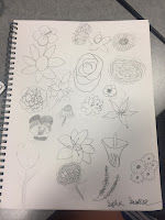
For this weeks assignment, we were told to draw either trees, birds, flowers, or houses. Once we had selected our choice we would have to sketch that item not once, not twice, but twenty times, each one being a different. I had chosen flowers so I had to draw twenty different flowers. My biggest struggle was finding different flowers that were noticeably different from each other but still being able to draw them. Once I had multiple flowers to draw, however, the process was quiet simple since all I had to do was sketch the flowers in an order that was appealing. To make the flowers different I found ones with different petal shapes and designs so that way you look at them and immediately tell they were different. At the beginning it was fun and easy because I had so many options but as time went one it started to become more difficult because I was running out of options. Overall, I think it made me a better graphic designer but it was still a little challenging.

Finally Being Able to Bloom

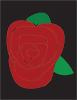
Once I had all twenty flowers drawn I had to choose one to make in Illustrator. I decided to make the drew in Illustrator. Choosing my flower difficult because I wanted a simple yet challenging flower so that way I knew I could do a good job but it wouldn't just be a bland flower. Originally I had chosen the flower in the top left hand corner but it wasn't turning out how I wanted so instead I made the rose. To start off making the rose I made the lines that would make up the petals in black.Then, once all the petals were drawn I filled them in with red. I also decided to add some shadows with black and highlights with a light red to the rose to add dimension  At this point I had decided I made the rose to big so I had to shrink it done in size a little. After I had made it a little smaller I had the leafs in a similar way I did the petals. Once the petals were done I had the rose a little smaller again. Then I made the background black so the red and green would pop more.

New Experiences 

Overall, I really liked this project because it was different and allowed for a little more creativity. This project was also difficult because of the number of flowers I had to draw and making the rose in Illustrator was difficult but enjoyable. I also really liked to project because instead of having a set picture or object we could create anything we wanted as long as it was a bird, tree, house, or flower. This project also allowed to see haw the tools we learned about in class are used to create actual designs. This is my favorite project we have done in graphic design so far.

Tuesday, February 14, 2017

DIVING DEEP INTO MY PSYCHE

The Type Of Person I Am

This week in graphic design we took a test that would tell us our personality based on the Myers-Briggs personality test. After taking the test I learned that my personality was an ENFJ. ENFJ stands for Extravert Intuitive Feeling and Judging. Having characteristics means that I am out going, love to be around people, I take part in a situation or action before I stop to think about what I'm doing, I am thoughtful toward other peoples feelings and what they think. I also see potential and promise in everyone and can be the most responsible in a group of people. I am not the only one with this personality type however, some people are ENFJ personalities as well. Some of these celebrities include Dr. Marin Luther King Jr., Nelson Mandela, Joe Biden, Oprah Winfrey, Bono, Jennifer Lawrence, Emma Stone, and many other people. It's kinda cool to think that I have the same personality of some of the most important, revolutionary people in history and also some of the most popular people in todays world.

How Well Does This Test Know Me

Most personality test don't do to well describing what kind of person you are, but this test is different.  After reading the description of an ENFJ I realized that is test described my personality almost to a T. The part of my personality it got right was that I am an extrovert, when making decisions I take other peoples feelings and thoughts into consideration, and sometimes I act before I think. The part that says I act before I think is both correct and incorrect. If I'm planning to go to the movies with friends then I while lots of thought and planning into it but if it's a spur of the moment thing thats when I act before I think. The most common situation where I act before I think is when I'm talking. Since I am an extrovert I talk a lot and I tend to talk really fast, so my brain doesn't have time to process everything that is coming out of my mouth. Reading my personality description helped me understand why I do talk so much and like being around people. It also helped me learn why sometimes I put my own feelings aside when making plans and putting somebodies in front of mine. I also learned why I get so bored when I'm sitting at home doing nothing.


The Role I Was Meant To Play

When ever I find myself in a group for school whether that be for a project, a seating arrangement, or just my group of friends I find myself taking charge and quiet possible be the one most talkative. After taking this personality test I realized I take on these roles natural because I am an extroverted, intuitive person. I also take on the role as problem solver because I can see where both sides are coming from but can help resolve the problem by relating to their feelings and talking about them. If I am assigned a certain role that fits my personality type then I am able to perform at my best ability and can help my team/group by contributing my best work. If the job I am assigned does not fit my personality type, then I will simply try my hardest to succeed even if I might not good or well suited for that job. I have a very loud voice and sometimes I don't realize how loud I am until somebody tells me. Some people in the past might have thought of me being purposefully loud, talking frequently or just being very energetic annoying and on purpose when I don't realize it because thats my personality type. Another part of my personality type is that I'm feeling which means I think about others peoples feelings. People who I have problems with usually don't have this personality type because they'll say something mean that could hurt a persons feelings with out realizing it. I don't like these people because I see them as rude, ignorant, and mean. 

Lessons To Live By

After taking this personality test I learned that personalities are very complicated and have many different parts to them. There are so many different parts that make up a persons personality that I had never known about before. I also learned that there are so many different types that several people have. All these different types are very important in groups and projects because everybody has a different way of doing things. Even though all of our personalities are different and unique thats what makes us valuable and needed. 

Personality Test Take Two

After we had finished learning about the Myers-Briggs personality test we took, we then took a LOBGR test. The LOBGR test tells you about your personality through animals. The test is made up of four columns that each have personality traits in them. To take the test you go across each row
putting the number 4 through 1, 4 being most like you and 1 being least like you, next to each personality trait. At the end you add the numbers in each column up. The column with the highest total is what animal you are. My highest total was in the first column which corresponded with a lion. Lions like to lead, are very goal-oriented, like challenges and assignments, are very aggressive, and in some situations tend to be a tad bit bossy. Me being a lion makes sense because I can identify with these traits of a lion.


Monday, February 6, 2017

COLORS!!!!!!!!

My Favorite Color To Look At

Most people in the human race have a favorite color, whether thats red, blue, green, yellow, or chartreuse. My favorite color just happens to be mint green.Mint green is my favorite color because it can either be bright and soft, can be used in clothing, foods, accessories, etc. and still look appealing. I also like how unique it is since its a tint, when you add white to color, and no not one of the primary or secondary colors in the color wheel. Whenever I wear something that is mint green, I always feel good and unique because nobody else is wearing it, I also look really good in mint green. The emotion si feel when I look at mint green are happy, calm, and peaceful. I like feelings these emotions because as life becomes more complicated and hacked they don't come naturally as much as they used to. Seeing the color also makes me remember  when I would go shopping with my friends or dad because if something was mint green it would stand out and I would remember it. Mint green is my favorite color because it makes me feel good, is pleasing to look at, and makes me think of pleasant memories. 


My Least Favorite Color To Look At

Just like favorite colors, most people have a least favorite color. My least favorite color is orange. I do not like orange because it is to bright and when ever its dimmed down it looks bad and unappealing. Orange clothing isn't the most appealing either and can look really obnoxious and gives me a headache. When I look at the color orange I get anxious sometimes because its mostly used for cation signs and,once again, because its so bright and loud. Unlike with mint green, I don't have any memories with orange so I can't associated with any good events in my life. Another reason why I don't like orange is because it was my grandfathers favorite color but he passed before I got to know him. Due to these events when ever I see orange it reminds of my grandfather I will never get to talk to, all I can do is hear stories about him. Since I don't have expositive feelings or memories with orange, it is my least favorite color. 


The Effects Of Color

Color is not just color. Color is emotions, feelings, moments, memories, designs, and so much more. When you look at a certain color you feel or think about an emotion, for example when you see red you think or anger. We also associate certain moments and memories with colors on occasion. When we hear wedding we think of white, when we think of pay day we think of green, etc. Companies use this advertisements so you feel a certain way when you see their logos and products. Technology company logos are blue so you feel calm while using it, food companies are red so they get your attention, and more. Color combination is also important. The combination of colors needs to look appealing to eye so that people like to look at it. Color combination is used most in graphic design because we want the design to look nice and appealing to the eye and a main part of how we achieve this is combining colors that look well together. If we did not do this then our designs would look sloppy and nobody would want to look at the design. We learned about how to see if colors complement each other by looking at a color wheel, like the one above, and looking in certain places according to the color I want to match.